Friday, December 11, 2009

Flood of 1993

Since we live in Missouri, I thought I would do a post on this event that most of us probably remember at least a little bit, and that had a huge effect on the Midwest.

The flood of '93 was one of the worst floods ever to happen in the United States. Basically, the year before the flood, rainfall was much higher than normal, and then that winter, there was heavy snowfall. These things combined created a lot of moisture in the soil and therefore led to the massive flooding that took place between April and August of 1993. According to Wikipedia, "Some locations on the Mississippi River flooded for almost 200 days while locations on the Missouri neared 100 days of flooding." The Mississippi River in St. Louis finally dropped back below flood levels on October 7, 1993.
I never knew this, but in August, after Valmeyer, Illinois had flooded, it was decided to intentionally break through a levee in order to save two important historic sites that were being threatened by the water, Prairie du Rocher and Fort de Chartes. In total, the flood cost the U.S. $15 billion, and it is the worst flood ever recorded on the Mississippi.

Missouri River flooding Chesterfield Valley

Flooding in Alton and along the Riverfront
JH

1980s Music

For this post, I thought I would do something on the music of the 1980s. I love 80s music, and I got to thinking that album art of the decade must have reflected the design style of the time. So here are some album covers that I thought were interesting.

Bon Jovi, Slipper When Wet, 1986: I thought this was an interesting cover because it mixes two typefaces, one more tame and the other kind of wild.

Journey, Frontiers, 1983: This cover really goes with the design of the 80s. It is technological and the typography has a very digital look. Just the fact that it is named Frontiers is interesting because the 80s were definitely a frontier of sorts for new tools such as the computer.
Foreigner, Agent Provocateur, 1984: So Foreigner got a little softer in the 80s, but I think this cover is fabulous. The bright primary colors were obviously popular in the 80s and the negative space creating the letter F is simple and eyecatching.

Power Supply, Budgie, 1980: This cover goes along with the technology theme as well, with a robot being worshipped by all these people.

Landscape, Einstein A Go Go, 1981: Apparently these guys were quite the one hit wonder, but the typeface they used for their name at the top is very digital looking and 80s.

Madonna, Madonna, 1982: I thought this was interesting, one of the AIGA medalists Carin Goldberg, designed Madonna's first album cover just after opening her own business in 1982. The cover is not particularly representative of 80s design typographically, but it is timeless.

And just a couple extras:
This is not an album cover, but I thought I would include it anyway. It was a submission winning second place in the Society of Publication Designers 2008 student competition, and the hand drawn type and the bright colors are definitely a throwback to the 80s.

This image is seen in the new Lady Gaga video for the song Bad Romance, which is set in a creepy version of a Russian bath house. Someone obviously paid attention to Constructivist typography when choosing the typeface to use here.

http://www.progarchives.com/

JH

Thursday, December 3, 2009

Alex Pardee


Coming to the end of class, we touched on contemporary art. One of my favorite contemporary artists is Alex Pardee. He was a broke artist in California who worked a ton of mindless side jobs and then in his spare time he would work on his passion : his art. He would spend most of his money printing his pieces and then would go to places like sperm banks and reception areas of random buildings and place his artwork inside magazines. Almost 2 years ago he was recognized by the rock band The Used and they commissioned him to created the art work for the album Berth. The pieces of his i really love are when the background is a random assortment of dripping bright colors with a graphic image drawn over top of it. I had never seen anything like his stuff before. I love that he combines intense images with bright colors. I also enjoy his pen and inks. 


LH

http://eyesuckink.com/gallery/personal-art/page/2/

Childhood cartoons


So during a class discussion we talked about the  1990's and the emergence of grunge. I was a kid in the 90's, so it got me thinking about all the 90's cartoons that i used to watch like...


Doug: a cartoon about a 6th grader, his friends and his dog all living life in a suburban area.  


The Angry Beavers: about 2 friends Daggett and No
rbert who lived it up as bachelors in the forest. 


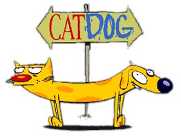
CatDog: stories 
from the lives of two conjoined brothers, one a cat and one a dog.


Ren 
and Stimpy: about a crazy chihuahua and hi
s not so intelligent friend, a cat.


Hey Arnold: stories about a 4th grader living with his grandparents in new york city. arnold usually would help a friend with a problem while learning things along the way.


And of coarse...Rugrats: this cartoon was about a group of babies and their not so nice older friend angelica as they created stories with their imaginations to entertain themselves.


Oh, to be a kid again.

http://en.wikipedia.org/wiki/Category:1990s_Nickelodeon_shows


LH